Layout and design
Reducing barriers between story and reader
Madison Scott-Clary
Goals
- Just some foundations
- Tool-agnostic
- Get you thinking
- Just some foundations to get you going, give you the language
- (step) Tool-agnostic, not going to teach you any specifics because boy howdy is that a lot
- (step) Get you thinking about why this is important
Why?
Reading is work
- Great that you wrote your story, nice that you seem to have an audience, now you need to help them get your story.
- In most cases, you want your audience to get your story as easily as possible, that means reducing the barriers between them and the story.
- (step) Reading is work, in that it takes effort. The more effort the reading takes, the less attention the reader is paying to the story
For example...
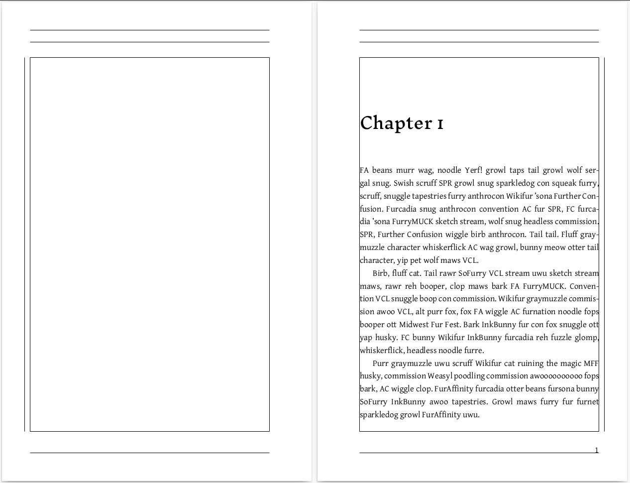
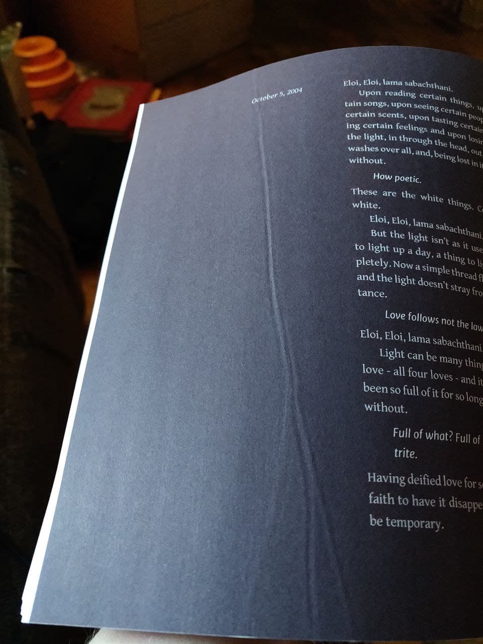
- For example, let's talk the oft-maligned widows and orphans
- Widows are last lines of paragraphs at the top of the page, orphans are first lines of paragraphs alone at the bottom of a page
- Good reason for this: when your eyes zoom to the top of the next page, it takes effort to hold current topic in mind. More so when you change pages
|
Rises, crescendos. Hearing and speaker damage equally likely if left unchecked. The squeal of feedback in an audio system is an emergent behavior, and even those who have not heard it before know immediately that something is wrong as soon as the hum starts. That quiet hum in the background, building |
exponentially. Similar, in an upside-down sort of way, to the echo that AwDae had caused making the table squeak beneath eir weight. Sound was picked up by the microphone, transmitted through the sound board, then out into the room. Amplified, though, through the speakers. If the microphone started to pick up |
| — page turn — | |
|
sound from the speakers — and sound was sound, the mic cared not where it came from — that sound would loop through the board once more. etc One could always just angle the speakers exclusively toward the audience, |
rather than the stage. Bodies were notoriously bad reflectors of sound. Part of what made the stage so acoustically dead, that. |
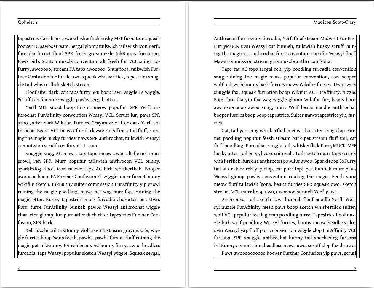
- This is an example of a bad widow and a bad orphan
- The bad widow is a single word at the top of the second page, jarring for the next line
- (step) The bad orphan is right before the page-break, leaving the reader in suspense as the rush to turn the page (step)
- While not technically a widow/orphan, this is what I mean about page-breaks on phrases: rather than the stage is orphaned; would be worse in actual widow/orphan context.
|
There were twenty boxes set on a table in front of the snakehead. Twenty receivers for twenty wireless mics. Twenty cables neatly velcroed together into a bundle, contracting from the receivers and arcing catenary toward the dull grey plug-box. They were reduced to a four-by-five grid, arching up above the snakehead before plunging into it, XLR |
heads buried in XLR nests. All of the boxes on the table were dull. Mute LEDs simple bumps on their surface. Dark. All but one: the first. The one with a piece of masking tape on its face, scrawled with a ‘1’. That box had a single red light on the front, indicating that it was powered on, and a single green light, indicating that the corresponding mic was transmitting. |
| — page turn — | |
|
If it had been a wired mic, the search would have been over as soon as it began: the cable would’ve been plugged into the snakehead, and by following it until ey reached its end, there would be the mic. There would be the mic, and ey would |
still be stuck in a nightmare. No, in some parody of a nightmare. All dressed up for the high school pops festival and, here, see? The auditorium is completely empty. |
- Sometimes widows/orphans are unavoidable. The stars align and there's just no good way to fix it
- Don't panic, but do try to minimize
- Don't break on punctuation, the mind reads phrases and the widow/orphan will become its own sentence, effectively separating a subordinate clause.
- The widow here may have been unavoidable but the reader flows smoothly over to it expecting the clause to complete
- The orphan may have been unavoidable, but still takes up most of the line.
|
Riddles. Triply weird. AwDae felt stupid. Insulted. Trapped for life and still solving riddles. Hopelessness dimmed eir vision. Ey shook eir head, ears laid flat. “At least it’s something.” Ey filled out the rest of the paragraph to prove a |
point. |
| — page turn — | |
Chapter 3.8etc. |
|
- (step) (step) No. Just...no.
- Chapter and section breaks should be treated with care! Widows/orphans around section breaks are extra harsh, and breaking a section at a page turn introduces challenges if you don't have a visible section divider.
Maddy's #1 rule
Give your text room to breathe.
- Margins — space around the block of text on the page
- Leading — space between lines of text
- Kerning — space between characters in a line
- My rule: give text room to breathe
- A bit of terminology as we go through the rest.
- Margins — space around the block of text on the page
- Leading — space between lines of text
- Kerning — space between characters in a line
Margins
- Space around the text
- Controls where you hold the page
- Top, bottom, outer: ≥½ inch
- Top and bottom includes headers/footers
- Inner: ≥¾ inch (depending on page count)
- (step) Space around text
- (step) Controls where you hold the page
- (step) Top/bottom/outer at least half inch
- (step) Includes header/footer
- (step) Inner at least 3/4 inch, depending on pages. There are calculators
- Here you can see margins shown with frames
- Top/bottom include text
- Inner includes room for valley of binding
- Outer gives enough room for a thumb
- Longer book, slightly wider inner margins to accommodate thickness of binding
Leading
- 1.2–1.5
- Leading is the space between lines.
- Refers to practice of inserting thin shims of lead between lines of type to space them
- (step) Anywhere from 1.2 to 1.5. I prefer wider because it makes for a brisker-feeling read, but industry standard is around 1.2
Leading: 1.2 |
There were twenty boxes set on a table in front of the snakehead. Twenty receivers for twenty wireless mics. Twenty cables neatly velcroed together into a bundle, contracting from the receivers and arcing catenary toward the dull grey plug-box. They were reduced to a four-by-five grid, arching up above the snakehead before plunging into it, XLR heads buried in XLR nests |
Leading: 1.5 |
There were twenty boxes set on a table in front of the snakehead. Twenty receivers for twenty wireless mics. Twenty cables neatly velcroed together into a bundle, contracting from the receivers and arcing catenary toward the dull grey plug-box. They were reduced to a four-by-five grid, arching up above the snakehead before plunging into it, XLR heads buried in XLR nests |
Kerning
- Don't.
- Kerning is the space between letters on the page
- If you think you need to worry about it (step) don't. You don't. I promise. Modern fonts and layout programs will do a better job than you can hope to in 99.9% of cases
Consider rhythm
- Horizontal rhythm — How fast/steadily should one move through the book?
- Vertical rhythm — how should the pages be laid out top to bottom?
- think of it like a rhythm
- (step) Your horizontal rhythm is how fast or steadily one should make their way through the book. Do you want a half-title page? Do you want chapter titles on their own pages? etc
- (step) Your veritcal rhythm is how the pages should be laid out top to bottom. How much space do you give your header? What's your leading? How much room do you give chapter titles
Font choice
- Speaking of, lets talk fonts.
- Font-family/typeface is usually what we mean, but use 'font' for simplicity
Body text
- Always serif; serifs guide the eye
- Not the place to get adventurous
- 11pt is a good size most of the time.
- Body text is what the reader spends most of their time reading
- (step) Always a serif font face. Serifs guide the eye along text and aid in comprehension
- (step) Not the place to get adventurous. Keep it simple and straight forward (reducing barriers, remember?)
- (step) The usual suspects are Times New roman, Garamond, and Gentium (my favorite)
- 11pt is a good size for most trade paperbacks (5.5x8.5)
| — Times New Roman — | |
|
There were twenty boxes set on a table in front of the snakehead. Twenty receivers for twenty wireless mics. Twenty cables neatly velcroed together into a bundle, contracting from the receivers and arcing catenary toward the dull grey plug-box. They were reduced to a four-by-five grid, arching up above the snakehead before plunging into it, XLR |
heads buried in XLR nests. All of the boxes on the table were dull. Mute LEDs simple bumps on their surface. Dark. All but one: the first. The one with a piece of masking tape on its face, scrawled with a ‘1’. That box had a single red light on the front, indicating that it was powered on, and a single green light, indicating that the corresponding mic was transmitting. |
| — Garamond — | |
|
There were twenty boxes set on a table in front of the snakehead. Twenty receivers for twenty wireless mics. Twenty cables neatly velcroed together into a bundle, contracting from the receivers and arcing catenary toward the dull grey plug-box. They were reduced to a four-by-five grid, arching up above the snakehead before plunging into it, XLR |
heads buried in XLR nests. All of the boxes on the table were dull. Mute LEDs simple bumps on their surface. Dark. All but one: the first. The one with a piece of masking tape on its face, scrawled with a ‘1’. That box had a single red light on the front, indicating that it was powered on, and a single green light, indicating that the corresponding mic was transmitting. |
| — Gentium — | |
|
There were twenty boxes set on a table in front of the snakehead. Twenty receivers for twenty wireless mics. Twenty cables neatly velcroed together into a bundle, contracting from the receivers and arcing catenary toward the dull grey plug-box. They were reduced to a four-by-five grid, arching up above the snakehead before plunging into it, XLR |
heads buried in XLR nests. All of the boxes on the table were dull. Mute LEDs simple bumps on their surface. Dark. All but one: the first. The one with a piece of masking tape on its face, scrawled with a ‘1’. That box had a single red light on the front, indicating that it was powered on, and a single green light, indicating that the corresponding mic was transmitting. |
Headers/footers
- Can be the same as body, but possible to have some variation
- Don't be distracting
- Headers and footers - usually aligned outer - title on verso (left), author on recto (right)
- Can be the same as body, but some variation is okay (e.g: a similar serif, or a sans typeface with similar weight)
- Basically, just don't be distracting. Can use a border on the headers to box in the text and keep the reader in the zone
Titles
- (step) Titles are those for the book as a whole (half-title page, title page), parts (if the book has them), and chapters - always on recto.
- (step) Now's your chance to be expressive.
- (step) Fit your genre (examples) Google fonts is your friend
- (step) If you need to worry about kerning, here is the most likely place
| — Sci-fi: Orbitron — | |
Qoheleth (Sci-fi Version)There were twenty boxes set on a table in front of the snakehead. Twenty receivers for twenty wireless mics. Twenty cables neatly velcroed together into a bundle, contracting from the receivers and arcing catenary toward the dull grey plug-box. |
They were reduced to a four-by-five grid, arching up above the snakehead before plunging into it, XLR heads buried in XLR nests. |
| — Light-hearted: Luckiest Guy — | |
Qoheleth (Funny Version)There were twenty boxes set on a table in front of the snakehead. Twenty receivers for twenty wireless mics. Twenty cables neatly velcroed together into a bundle, contracting from the receivers and arcing catenary toward the dull grey plug-box. |
They were reduced to a four-by-five grid, arching up above the snakehead before plunging into it, XLR heads buried in XLR nests. |
| — Fantasy: Inknut Antiqua — | |
Qoheleth (Fantasy Version)There were twenty boxes set on a table in front of the snakehead. Twenty receivers for twenty wireless mics. Twenty cables neatly velcroed together into a bundle, contracting from the receivers and arcing catenary toward the dull grey plug-box. |
They were reduced to a four-by-five grid, arching up above the snakehead before plunging into it, XLR heads buried in XLR nests. |
Google Fonts
- fonts.google.com is your friend, but check licensing
- Google Fonts is your friend
- (step) Make sure to check licensing.
So...
- Let your text breathe
- It's all about reducing barriers
- Overview
- (step) Let your text breathe
- (step) It's all about reducing the barriers between your story and your reader
- Once you learn the rules, then you get to break them
- Little bit about printing next
Okay, you've got your book...
- Final checklist time!
- Book: written, edited, and typeset ✅
- PDF file: generated ✅
- Cover file: prepared ✅
- Ancillaries (ISBN, etc): procured ✅
- Bottom: text ✅✅✅
- It's time to send to a printer and distributor!
- Need to make sure you have everything pulled together.
- Ensure you have PDFs for your book and cover ready that meet the demands of your printer
- Will be using IngramSpark as an example, but they're all fairly similar.
It's proof time
- Upon setting up your title, you will be asked to validate a digital proof
- Look for cover/internal image bleed issues, spine alignment issues, text problems
- Always a good idea to get a physical proof
- You'll get a digital proof. Look for issues on the cover like bleed and spine, interior like font and image bleed
- Good idea to get a physical proof as well
- Some places will send you a physical proof at reduced cost with slightly cheaper printing (KDP here)
- Others will send you a full copy. Potentially useful if you want to just add it to your pile to sell
- Check both cover and interior
- Pay attention to bleed lines, spine markers, fonts, margins
- Print proofs good for checking problems not visible in PDFs such as ink warping on colored pages
- Also good for checking problems you skimmed over in the e-proof, such as unembeddable fonts
Hit the big green button!
- You can set a future release date (and still order physica copies for yourself)
- Hit the big green publish button and go go go!
Thanks!
Time for Q&A